If you’re the proud owner of a restaurant, you understand the pivotal role your website plays in shaping the initial perception that potential customers form about your establishment. Given its status as the primary gateway to your culinary world, the design of your restaurant’s website should be nothing short of exceptional. In the forthcoming discussion, we present a curated selection of 10 exemplary restaurant website designs that encapsulate the perfect fusion of aesthetic appeal and functional prowess. These handpicked examples showcase a diverse range of attributes, from visually captivating layouts that skillfully exhibit tantalizing dishes to seamlessly navigable interfaces that transform online ordering into a seamless experience. Each of these websites succeeds in encapsulating the distinct ambiance of the respective restaurants, be it the refined sophistication of an upscale fine-dining venue or the inviting charm of a neighborhood cafe. Brace yourself to indulge in the visual feast provided by these delectable website designs, each meticulously crafted to etch a lasting impression on your hungry online visitors. Join us as we embark on a journey into the realm of culinary-inspired creativity, exploring how these ten restaurants have masterfully harnessed the art of captivating their digital audience.
10 Exemplary Restaurant Websites from Across the Globe (A-Z)
The realm of exceptional restaurant website designs is vast, but within this expansive landscape, we have identified ten establishments that stand out as exemplars of online excellence. Join us as we explore a selection of the finest restaurant websites!
1. 4 Rivers Smokehouse
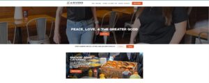
The 4 Rivers Smokehouse restaurant site has 13 locations spread all over Florida. They have a really professional-looking website where visitors can view the menu, order catering, buy gift cards, and order online. Overall, it provides a great user experience.
2. Amsterdam Brewhouse
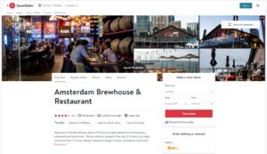
The Amsterdam Brewhouse has three Toronto locations. Their website has a really clean, professional look to it. They have simple and easy-to-locate navigation that allows customers to buy beer and merch and lets them access information about their restaurants and events.
3. Anton’s
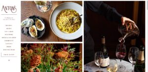
Anton’s website design has a bit of an older feel to it, but everything is laid out perfectly for the customer to browse what’s for sale. The important things are above the fold, like a button to their rewards program, and links to their é-Market and menu.
4. Between The Bread
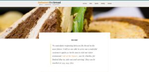
Between the Bread has three locations in New York City. Their website is beautifully designed with easy-to-find navigation that gives the customer easy access to all of the different offerings like accessing the menu, ordering online, contacting info, or catering. They also have a slideshow above the fold displaying what they have to offer visitors.
5. Bistro On The Greens
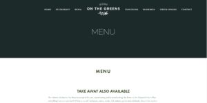
My first impression of the Bistro On The Greens website design is a sense of calm and relaxation. It’s a very simple and clean design that provides all of the necessary information for customers visiting their website. They display pictures of their beautiful-looking restaurant and delicious menu.
6. Block 16
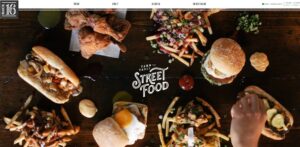
As soon as you visit the Block 16 restaurant website, you’re bombarded with images of a lot of delicious-looking food. This instantly lets the visitor know what kind of food to expect from this restaurant. It’s a very simple, professionally designed website that focuses on Block 16’s strengths.
7. China Poblano
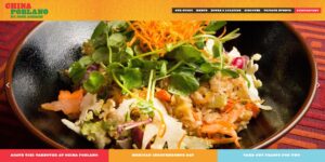
China Poblano, located in Las Vegas, Nevada, is powered by Bentobox. As soon as you visit their home page, images of the delicious-looking food make you want to jump through your computer screen. They display some of their delicious cuisines and have a navigation bar at the top.
8. Chocolat
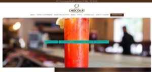
If you love gelato and chocolate, then you’ll love Chocolat. They have several locations in Singapore and one in Milan. They have a fun design displaying several of their creations with a humorous-looking cow on the home page. Scroll down the home page and you’ll see images of their luxurious-looking shops.
9. Chotto Matte
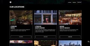
Chotto Matte is located in North America, Europe, and the Middle East. As soon as you land on their homepage, you’ll experience what it’s like to visit one of their restaurants. They use a video above the fold to show potential customers what the food and atmosphere are like.
10 . Coast
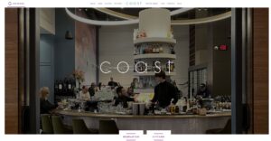
Coast, located in Canada, does a great job of showing what their restaurant looks like, as well as providing links to any information a customer would need. They have links to their menu, reservations, and more all displayed above the fold.
