Design systems are frequently called the “single source of truth.”
That’s because they help internal teams who are working on common projects to follow a set of standards or guidelines. This is done by using a collection of elements, components and patterns to create a consistent user experience. It also allows teams to scale their products in an efficient manner. Design systems, as a result, can save teams a ton of time.
And a number of companies are willing to share their design systems with others. In fact, Cisco, Uber and Apple want you to steal from them. Yes, that’s right.
They are among the plethora of companies that want you to use their design systems. And what’s in it for these companies? Having design guidelines available to the public makes it easier when developing new partnerships or creating new services, reports Prototypr, a prototyping and UX design blog.
Design System Examples
- Adobe Spectrum
- Apple Human Interface
- BuzzFeed Solid
- GitLab Pajamas
- Google Material Design Systems
- Mailchimp Pattern Library
- Microsoft Fluent Design System
- Uber Base Web
- Zendesk Garden
What Is a Design System
A design system offers a complete set of standards with the goal of allowing designs to be managed at scale, reports the Nielsen Norman Group.
A company’s design system is a collection of reusable components, patterns, guides and codes for building websites and apps that its UI and UX designers, as well as its developers, can reuse for the company’s own site, or that the company can also choose to share externally with others. Not only does it save time internally, but good and consistent design can make users happy.
A number of tech companies from Apple to Zendesk have design systems that are freely available, as do financial giants like Goldman Sachs or carmaker Audi. Here’s a look at where you can find them.
Design System Examples

Adobe Spectrum
Adobe’s design system Spectrum aims to make its applications more cohesive by offering users access to its principles, resources and implementations, Adobe stated on its website. Resources include its Adobe XD plugins, UI kits, fonts and icons. Spectrum also includes open-source implementations with detailed usage guidelines.
Apple Human Interface
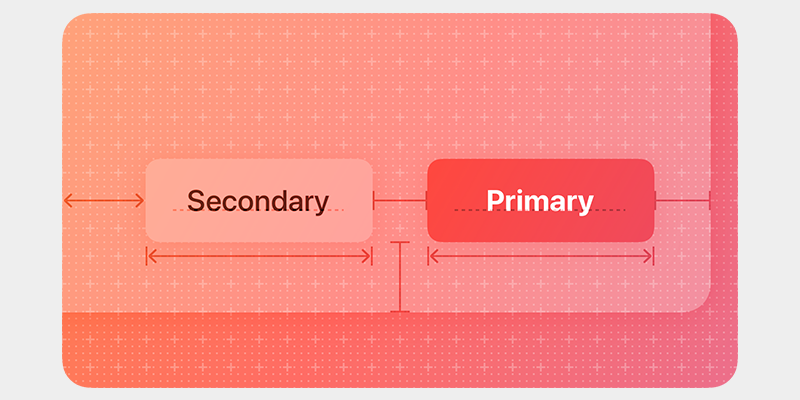
Apple Human Interface Guidelines (HIG)’s tools aim to help you design delightful user experiences for any Apple platform, according to Apple’s website. Its expansive foundations include inclusion guidelines, which can assist you in understanding how others may respond to the content and experiences you create. Onboarding is one of HIG’s patterns and helps you create brief, enjoyable experiences without the need to create a truckload of information for users to memorize. HIG’s buttons help you design ones that are quickly recognizable and easy to understand, which in turn gives the app an intuitive feel and a feeling of one that is well-designed.
Atlassian Design System
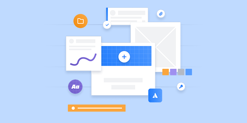
Atlassian is aiming to offer a one-stop-shop for design teams with its capabilities to “design, develop, deliver.” Atlassian’s IT service management tool allows companies to centralize customer requests as they come in, and manage and track them with its customizable help centers and embeddable widgets, Atlassian states on its website. The Australian-based company’s Atlassian Design System offers component and pattern libraries, as well as content and advice on stylistic foundations.
Audi Design System
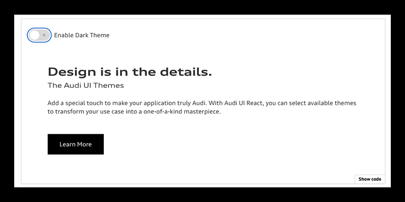
Audi Design System also offers a soup-to-nuts design system, which ranges from “Getting Started” guides to core components intended for adoption within each product, the carmaker said. Audi’s design system aims to create a single source of truth for product teams and improve user experience with its consistent components, design interactions and patterns.
BBC Global Experience Language
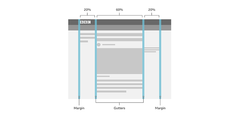
Media Giant BBC shares its design system via its Global Experience Language. Its design system includes foundations, such as how to design with motion to establish a connection with a product, to design patterns, which include information about accordions that offer a vertical list of headers that users can interact with to reveal or hide the content within them. BBC’s Global Experience Language also shares how-to information like tailoring UX research to provide insights for effective website copy, the media giant said.
BuzzFeed Solid
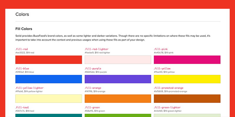
Forget a firm footing when it comes to receiving a set of standards and rules on using and writing Cascading Style Sheets (CSS) code. BuzzFeed offers up its CSS style guide Solid. With Solid, design teams can quickly prototype and develop features by creating new layouts and designs without having to write additional CSS code, BuzzFeed said on its website. It also offers some HTML and CSS components that are globally reusable.
Cisco Momentum Design
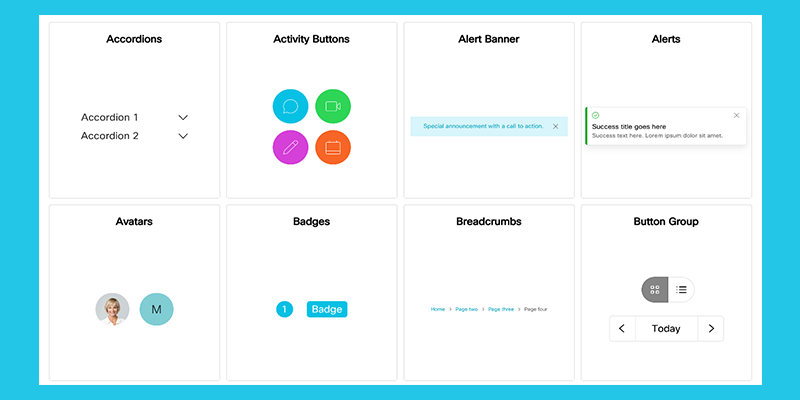
Revving up your website with Webex products? Then Cisco wants to share its Momentum Design System with you. It offers ways to create a shared design language, serving as building blocks for all of Webex’s products with tokens, components, icons and personality. Under its tokens, for example, Cisco notes Webex’s typography uses type to establish a visual hierarchy through style, weight and color to support communication efforts.

GitLab Pajamas
GitLab Pajamas Design System is a constant work in progress, GitLab unabashedly said. The open source design system contains brand and product design guidelines and UI components for all things Gitlab, such as its Figma UI kit which helps users create designs in Figma and then transfer them over to GitLab.
Goldman Sachs Design System
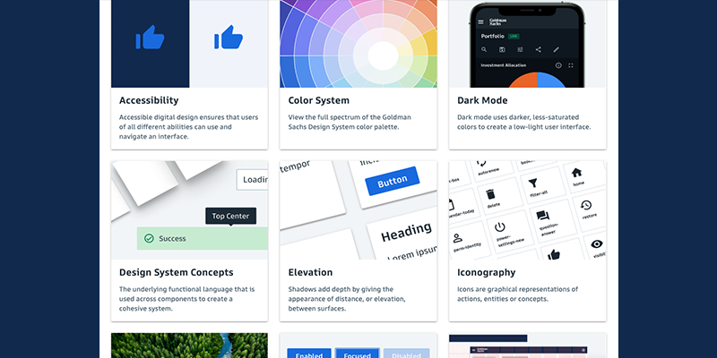
Cha-ching! Investment banking giant Goldman Sachs is giving design teams who work on institutional finance websites access to its design via its Goldman Sachs Design System. Its components, for example, can help design teams create currency buttons and also ways to send an email or download a document off of a financial website. According to Goldman Sachs, its design system also offers a UI color palette under its color system which can help color blind users discern differences between data points by having distinct colors for various datasets.
Google Material Design System
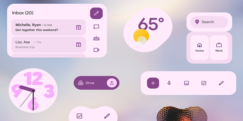
A Google search on design systems ironically doesn’t call up its Material Design among the first page of listings, but it’s worth the effort to track it down if you plan to incorporate Google products into your design. Material Design shows you when to use various components and how to customize them. In addition to the usual offerings, Material Design also provides users icons and tutorials for developers and unifies UI and UX on different platforms, devices and input methods, Google said.
Gov UK Design System
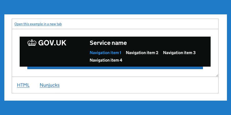
GOV.UK provides a bevy of information on various services offered by the UK government, ranging from moving to the region to finding birth, marriage and death certificates. Its GOV.UK Design System helps public service design teams make their websites have the same feel as its GOV.UK site, with guides on applying layout, typography, images and color to their sites, GOV.UK said.
IBM Carbon Design System
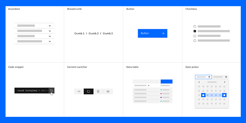
Big Blue’s open-source IBM Carbon Design System relies on its IBM Design Language as its foundation, according to IBM’s website. Fueled by an active community of contributors, the design system maintains design kits containing Carbon components. Figma, Sketch and Adobe XD are some of the design kits offered and maintained by Carbon, while the Axure kit is maintained by the community.
Mailchimp Pattern Library
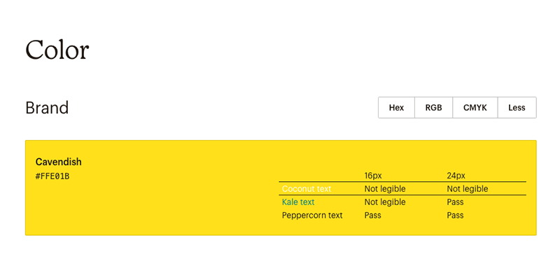
No monkeying around here. Mailchimp Pattern Library offers an expansive design system with a pattern library that not only includes color and typography but also data visualization and a grid system, according to Mailchimp. Buttons, lists and navigation capabilities are also among the components offered.
Microsoft Fluent Design System
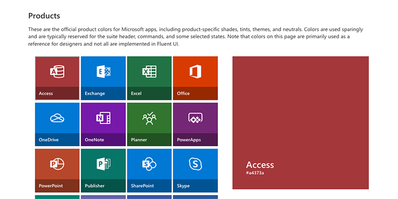
Open-source, cross-platform Microsoft Fluent Design System offers up frameworks for designers and developers to create experiences that aim to be engaging and provide accessibility, internationalization and performance, Microsoft states on its website. Design teams can pick platforms ranging from iOS to Android.
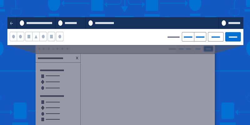
Salesforce Lightning Design System
With its marketplace of cloud-based CRM apps, Salesforce said users can find a way to tie them together with a similar look and feel with its Lightning Design System. Its design system fundamentals cover component blueprints, tokens, design guidelines, and tools. It also offers a way to design a system that can quickly scale as your business grows and includes Accessible Rich Internet Applications (ARIA) specifications and guidelines so you can create a site end-users with disabilities can also access.
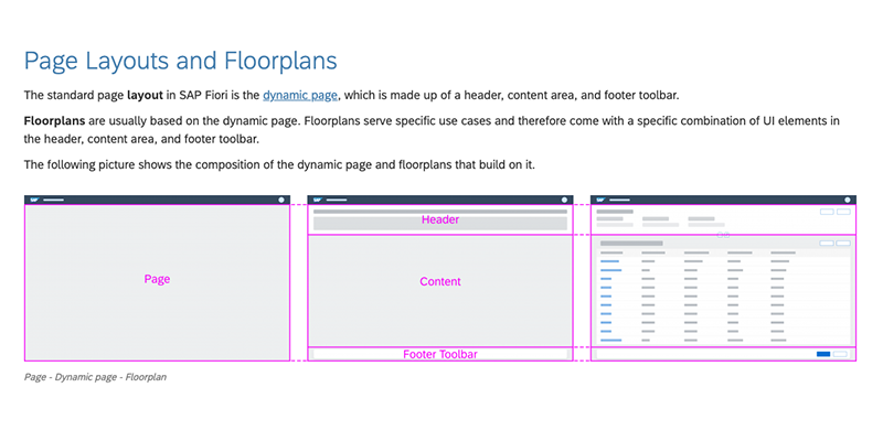
SAP Fiori Design Guidelines
Enterprise software giant SAP’s Fiori Design Guidelines aims to lend a hand to design teams looking to create business apps with a consumer-styled user experience, SAP said. Fiori’s guidelines and tools are designed to help teams easily build and customize their own apps to be consistent with SAP S/4HANA and other SAP solutions.
Shopify Polaris
Shopping around for a design system to help you create an e-commerce site? If you plan to offer goods on Shopify, you may want to look at its Polaris design system. It offers up a component library, content on fundamental design elements and guidelines for ringing up a good merchant experience for end-users, according to Shopify.
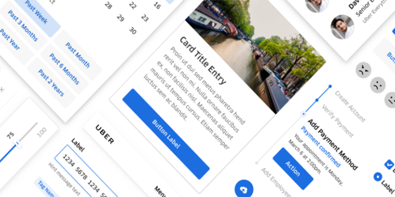
Uber Base Web
Uber’s design system Base Web allows teams to quickly and easily create web applications with its open-source toolkit of components and utilities that align with its Base Design System, Uber said. Base Web is designed to be reliable, accessible and highly customizable.
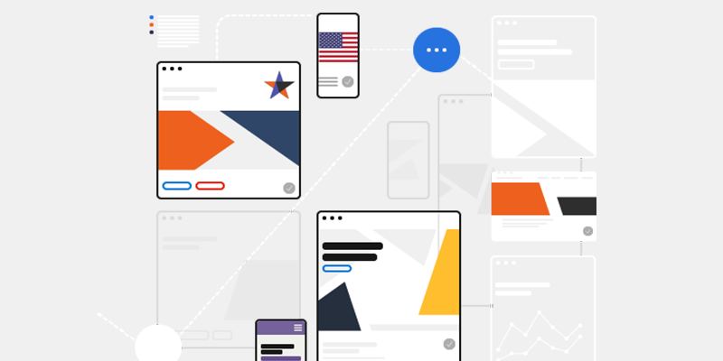
U.S. Web Design System (USWDS)
U.S. Web Design System, like the Gov UK Design System, aims to make it easier for public agencies and organizations to build government websites. USWDS also provides the tools to build accessible and mobile-friendly government websites, USWDS stated on its website. Breadcrumb is one of its components that help users understand where they are within a website via the secondary navigation.
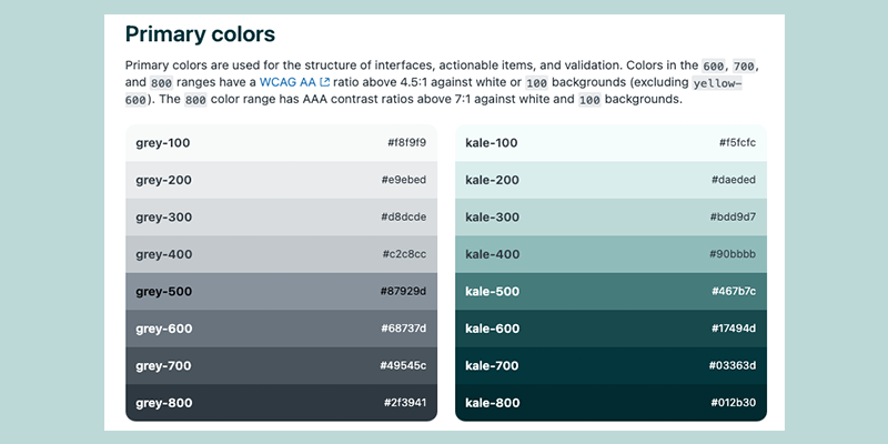
Zendesk Garden
Take a stroll through the garden, or, perhaps more specifically, the Zendesk Garden. Its design system aims to create a cohesive user experience throughout its product suite, the company’s website said. Its components combine the best practices from content, design and engineering to pull together user interfaces quickly, Zendesk said.