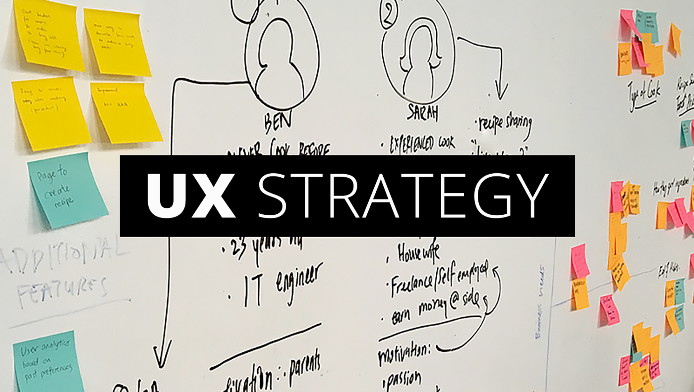
Best UX Designing: How to Create a 1-Page UX Strategy : Influence is the small word, but influencing users in practicality is no easy task. However, it becomes easy when you develop a strategy and stick to. The 1-page UX strategy is one of the most powerful methods to understand and device a strategic plan aimed to influence users and make the product stand out and do its desired task.
So, let us see how to go about it.
The first step of this process is to document it, by writing it down. When we say this, don’t get into a panic mode. Actually, you will not be writing much, even if you did, the entire process is going to be a fun ride. Bear in mind that you will not be creating a plan that runs several pages long. It will be a one-pager, and it will be crisp, tight, and to the point.
Here’s the overview of what will be going into your paper/document.
1. Vision
2. The 5 Ws of the Product
3. Specific Design Principles
4. Success Metrics
Let’s begin.
1. Vision
Write a three or four line paragraph about what the product you want it to be.
The paragraph should answer the following questions of your product:
What is it the app/product about?
What does it offer?
How does it help users?
What is the goal of the app/product?
Just explain the significance and scope of the product without stuffing too many details. Just describe the intent. It is exactly what we need to bring in this step. Once you know the intent, it becomes all the more easy to further strategize your product. Irrespective of any product, the goal remains plain and simple – to bring visions to life.
2. The 5 Ws of the Product
Who? What? When? Where? and Why?
The whole idea of filling information for these 5 Ws is to understand what circumstances holds true when a users uses your product. By explaining the 5 Ws you are likely to cover almost the entire gamut of circumstances for which your product offers solution.
Who?
Write down who will be your target audience and which age group does your product appeal to.
What?
Write down the facts about what the product offers. These facts could be backbone of your app or USPs [Unique Selling Points] of your product.
When?
When would the product be useful. Every product will have its ‘when’ time, even the apps/products that are being used throughout the day. So, it is imperative to mention the ‘when’ factor.
Where?
It could be a platform. It could be device. Or it could about a particular section of users that your product appeal to the most.
Why?
So, it is equally important to understand why a user would even need this product. How will this product change his/her experience [user experience] when they start using it.
3. Design for specific needs
It could be one of the most fun parts of the entire process; as it happens, it is also one of the most overlooked aspects. Why? Because most of the design strategies still aim for cliches like the product or app should be unique, fast, easy to use, and so on. Most of today’s apps has all these qualities.
So what else should you focus on?
The best way to avoid falling into the cliche trap is to be product specific.
List out design principles that are specific to your product’s services. For example, if your product has an intuitive and easy billing process, create a design principle where users will discern it effectively.
As UX designing is based on research, surveys, personas etc., the whole purpose of creating a design principle is to differentiate your product and set the bar high.
4. Success Metrics
Gauging the success metric of the product is as important any other aspect in 1-page UX strategy. According to Google Ventures, all UX metrics fall into HEART [Happiness, Engagement, Adoption, Retention, and Task success].
Writing down a common goal, such as ‘to get more traffic’ might not work. Instead, list out specific targets you wish to achieve like, the number subscribers for your app you’d like to achieve in three months, percentage of traffic increase, increase in time spent on your app, and so on.
With this last step in place, you finish the 1-Page UX strategy plan.
What next?
Once the draft is ready, go through it and tweak accordingly, and then feed them in a digital form. Now, you can invite concerned people or you might shoot copies to them. But, the best way is to sit together, brainstorm and take feedback from them.
This 1-Page Strategy you’ve created should be backed with solid research and analysis. The purpose of the brainstorming session help you gain two things:
Gives you an opportunity to ensure that you’ve not left any crucial stones unturned. It provides you with key takeaways to tweak the strategy further and make it even better.
What you’ll get in the end
Don’t wrap the brainstorming process after one session. Let it simmer in your and your stakeholders’ heads for some time; new ideas will crop up and new solutions will be born.
And the upshot of all this?
A clear, concise, neatly laid plan that makes execution just as easy and an create an output that is well in sync with the perceived vision of the product.
